Abdij van Averbode
Client of true.food agency and on their behalf
—
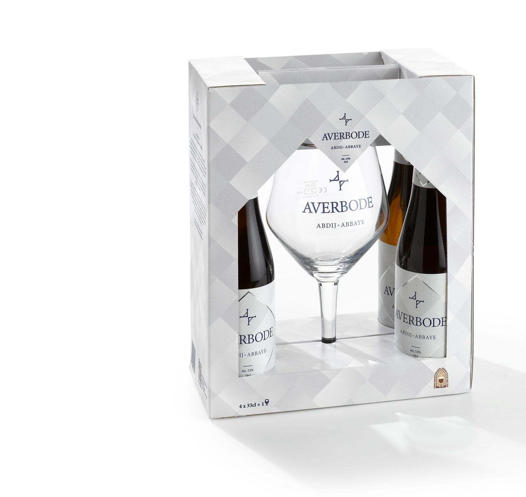
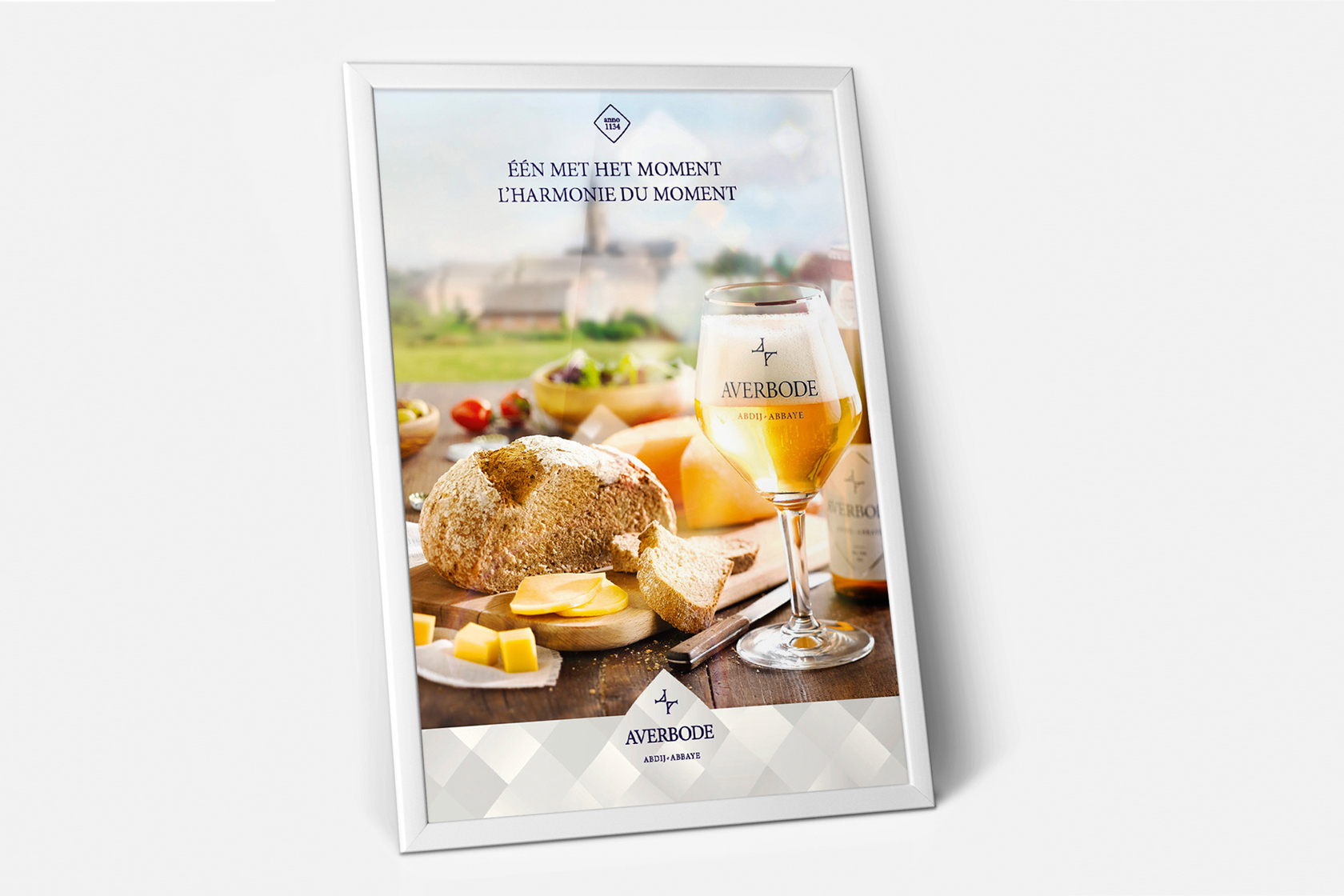
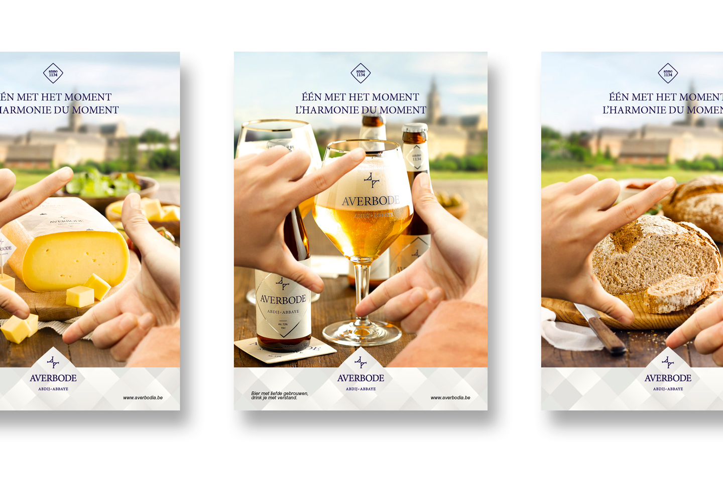
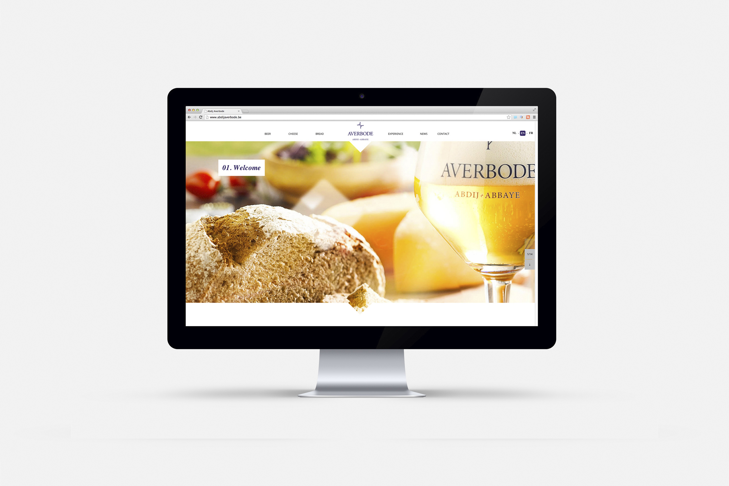
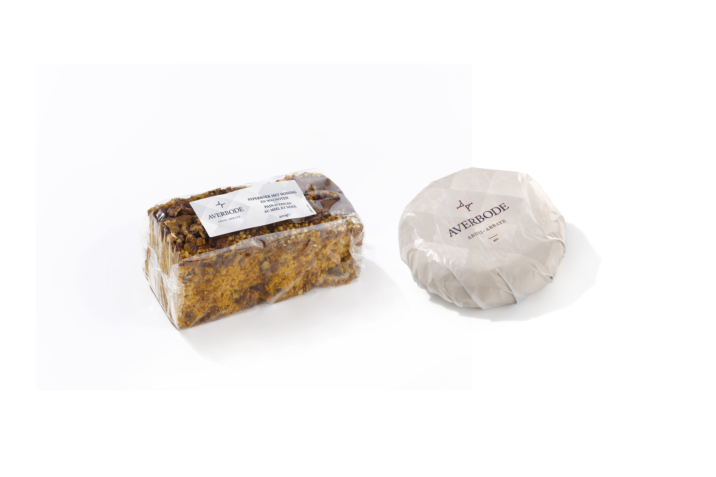
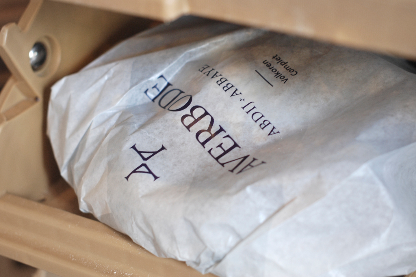
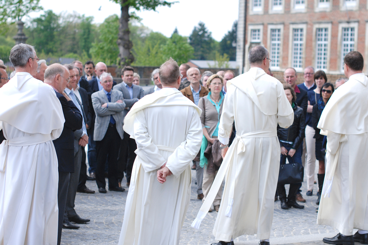
An abbey has always had an economic and social function. The Abbey of Averbode was looking for new economic sources. To begin we referenced the existing heritage of the abbey’s economic sources: beer brewing, milk production and bread baking. This is how we chose the packaging of the basket of beer, cheese, bread and gingerbread. Together with the Abbey community we experienced an intensive and serene process that resulted in a beautiful concept and brand story.
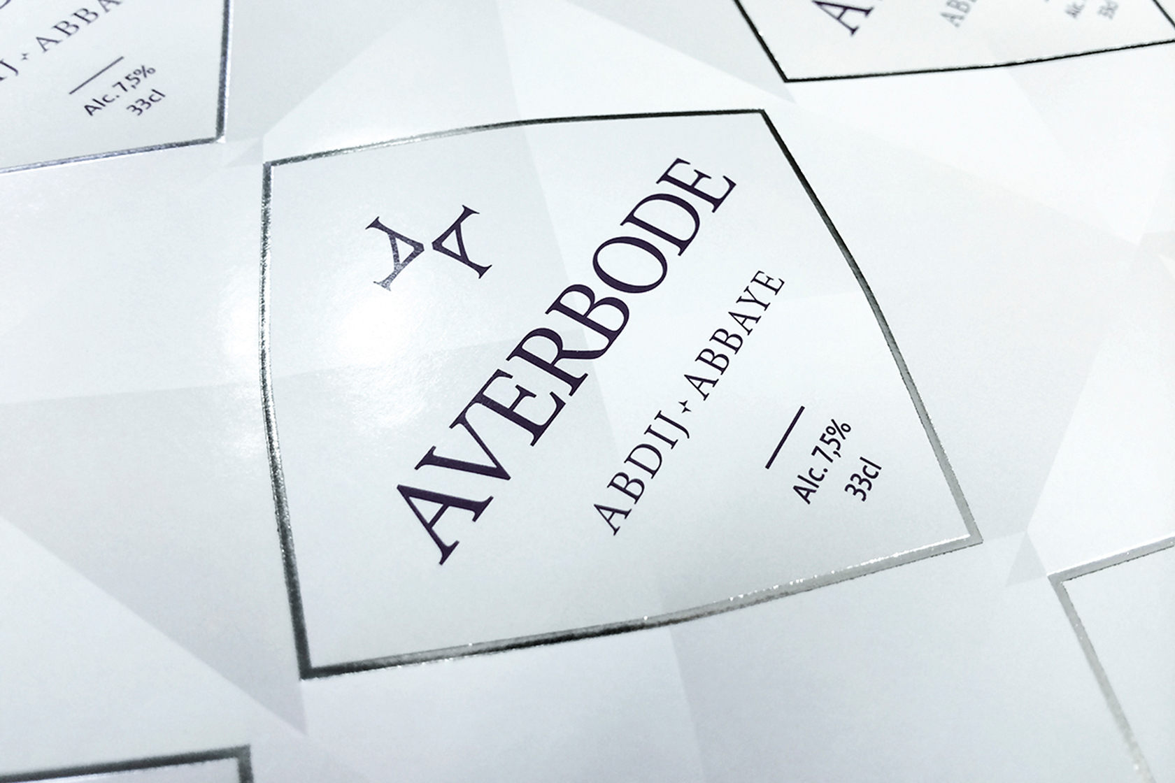
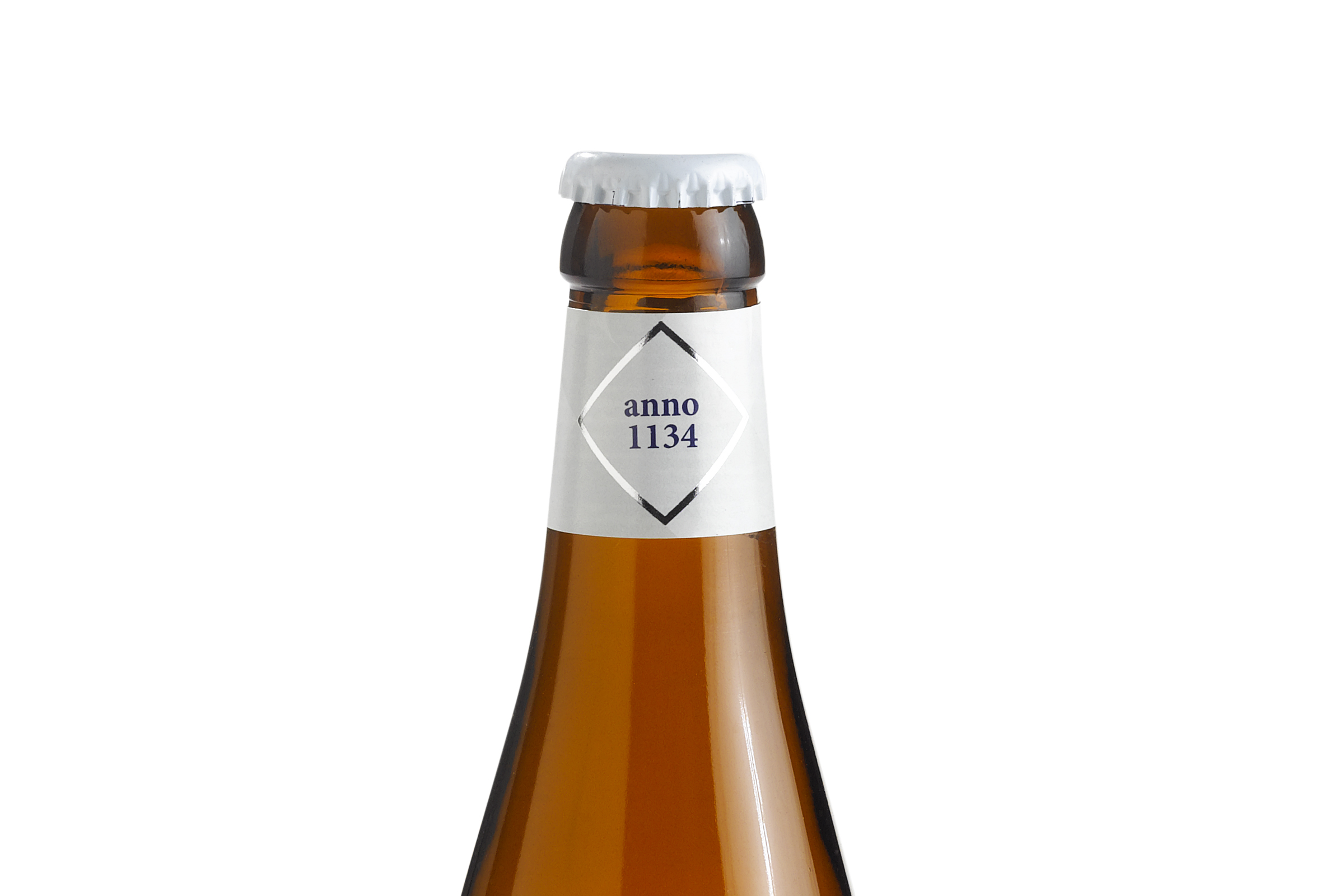
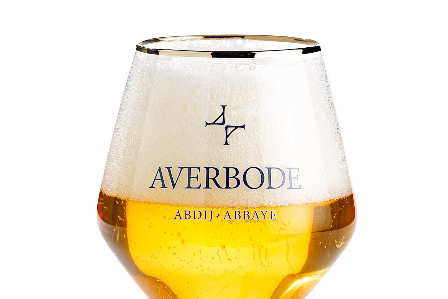
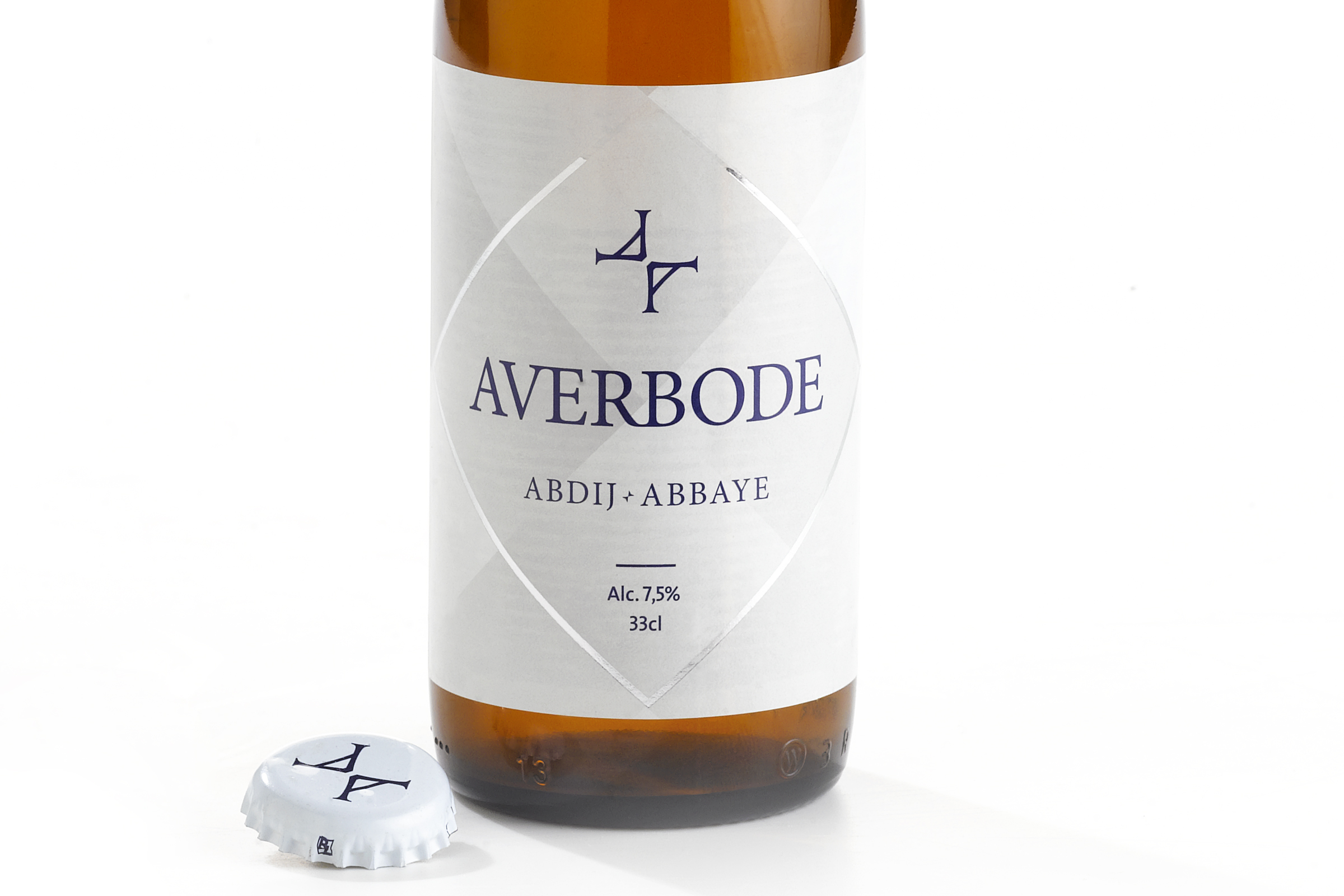
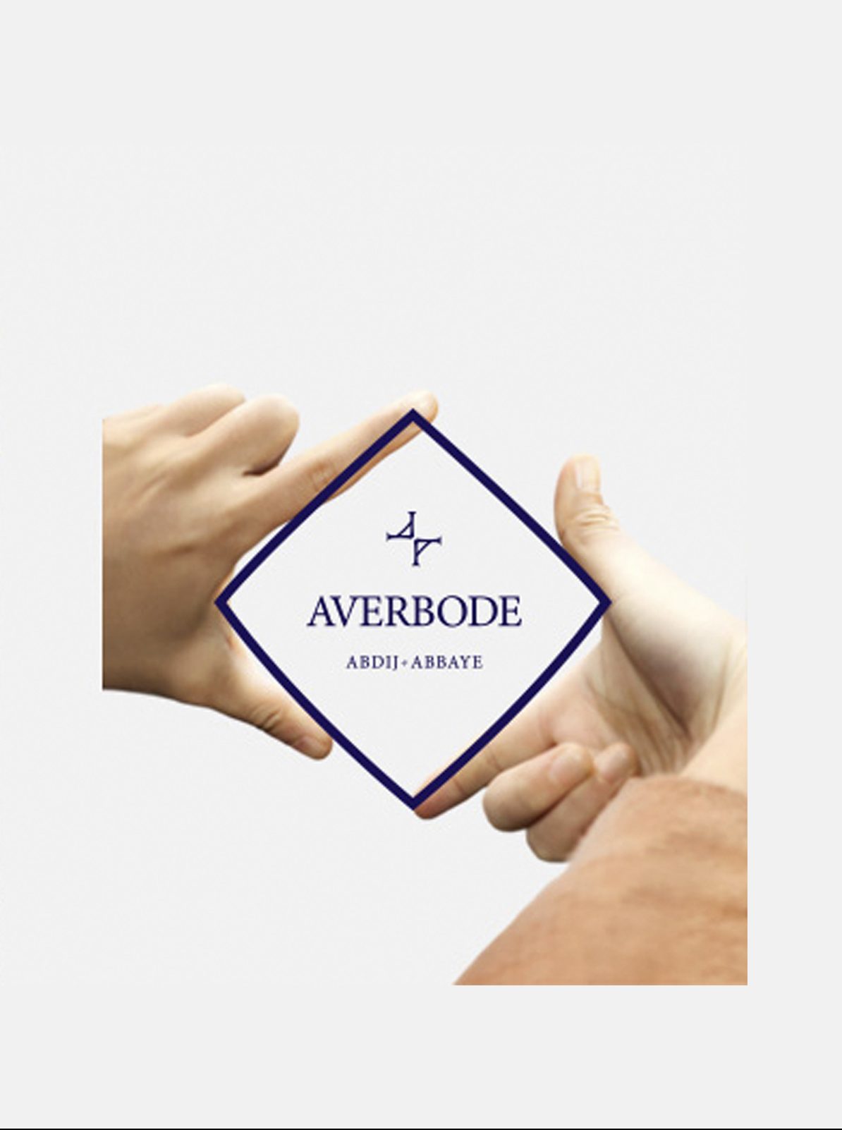
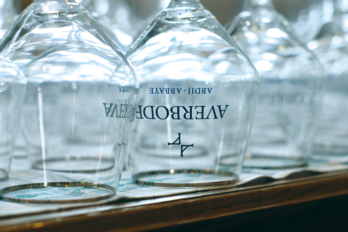
The story of the Norbertine community reflects the style of their brand. The reflection is not only in the logo but also in the style that is serene and white and works with a touch of silver or gray. The diamond shape refers to their ‘connecting’ factor and the many interfaces that it has in society. The diamond shape is also found as a form located in and around the abbey in tiles, stained glass and symbolism.
#strategy #positioning #branding #logodesign #packaging #marketing #advertising #pointofsalesmaterial #productlaunch #websitedesign