Brouwerij Huyghe
Client of true.food agency and on their behalf
—
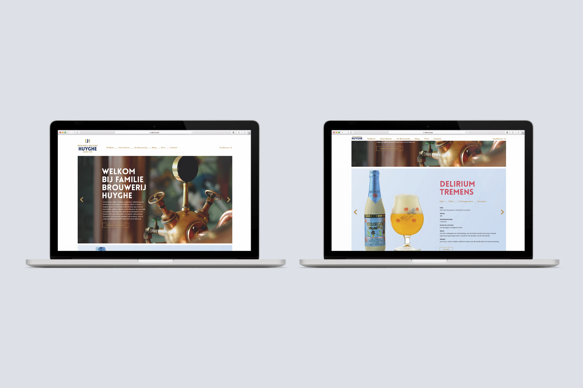
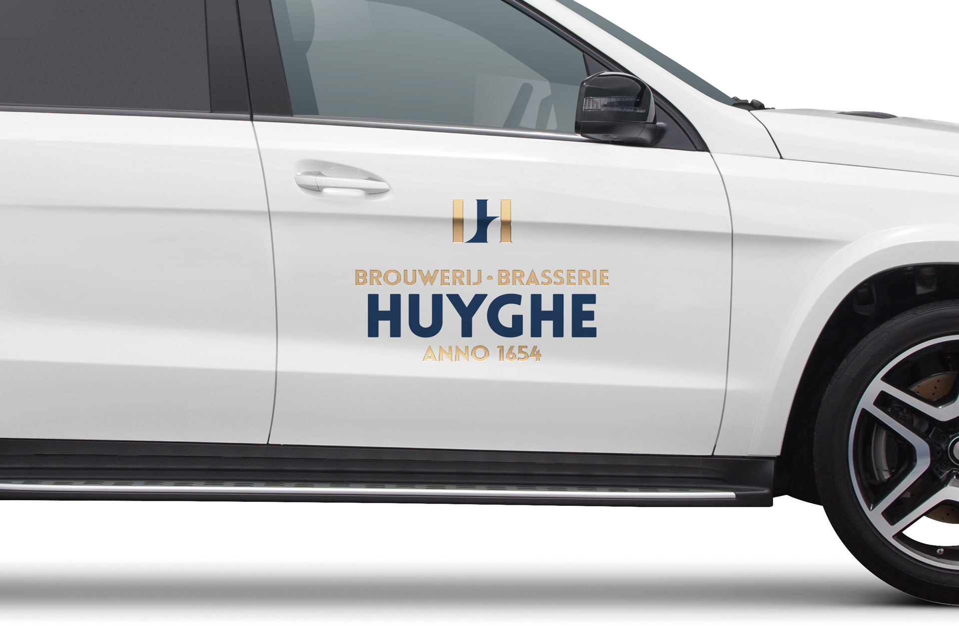
The brewery, which belongs to one of Belgium’s oldest institutions, needed its own facade. For years, their identity was linked to that of their best-selling beer, Delirium Tremens. With a completely unique brand DNA and story, a suitable identity style and brand book was written with a good pint.
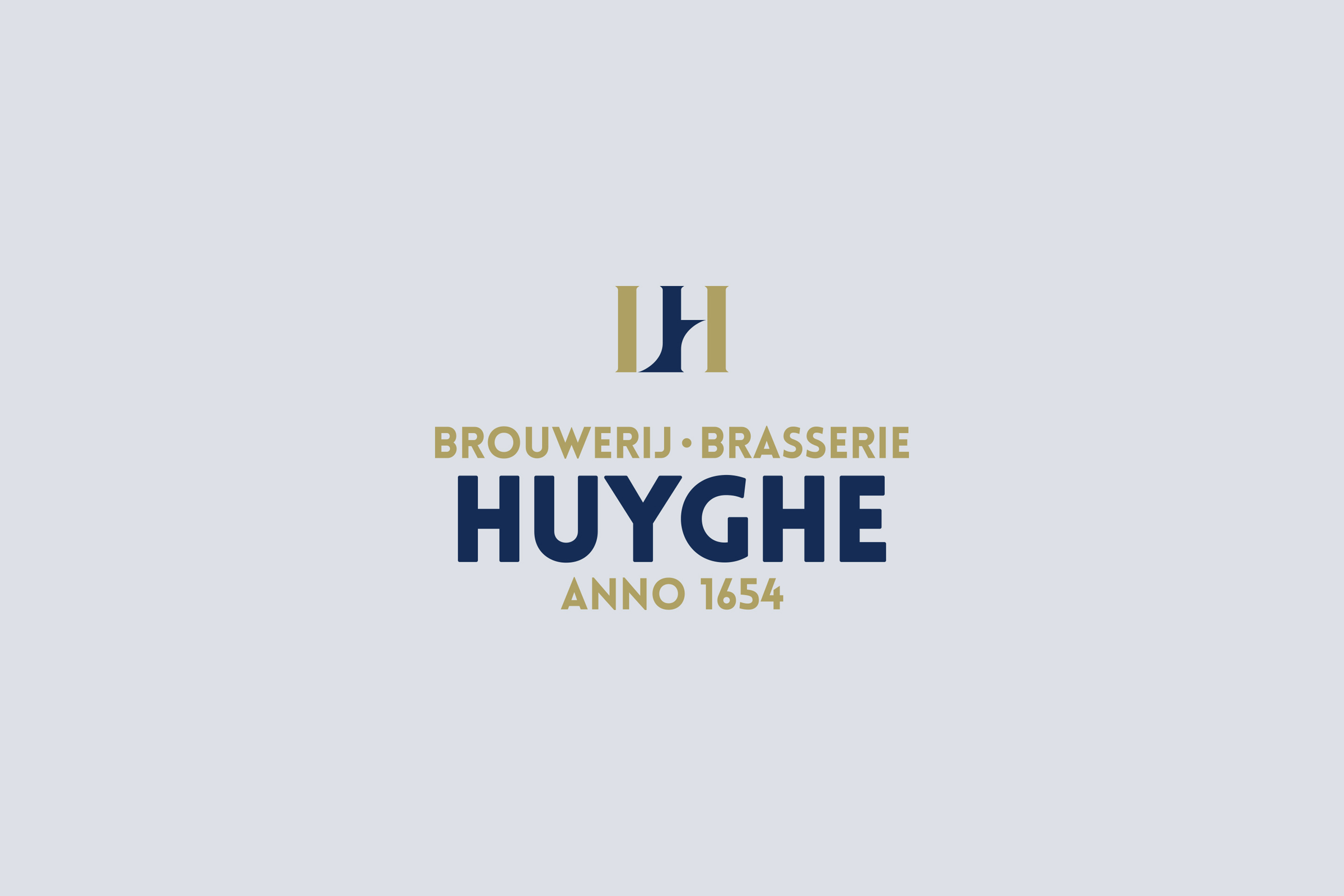
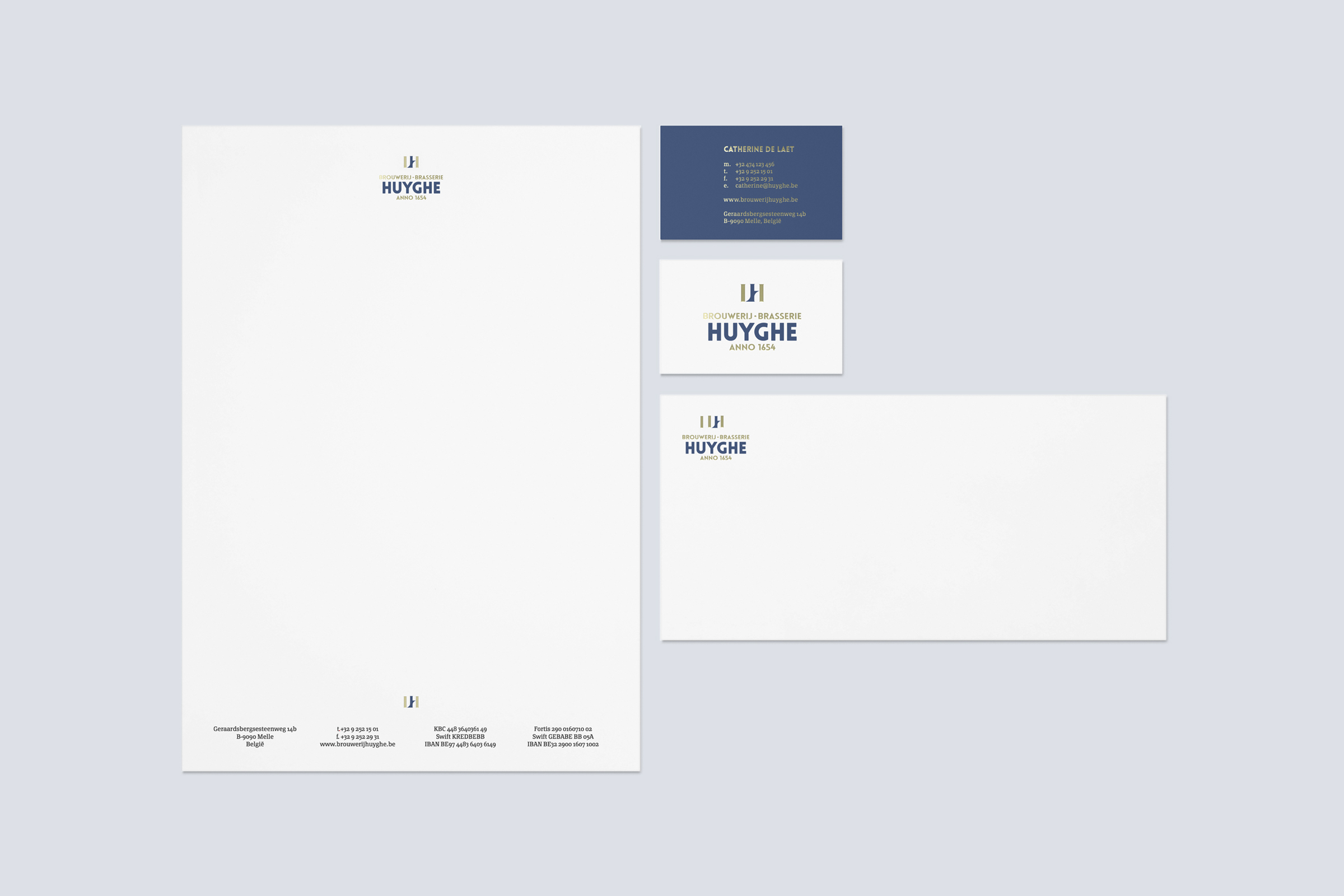
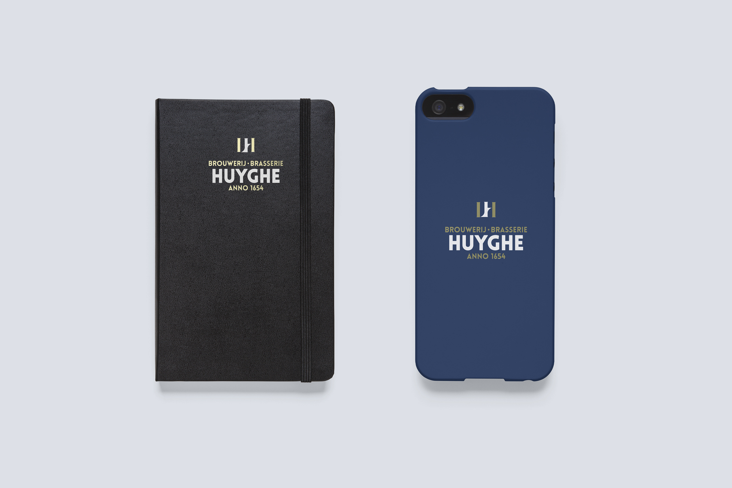
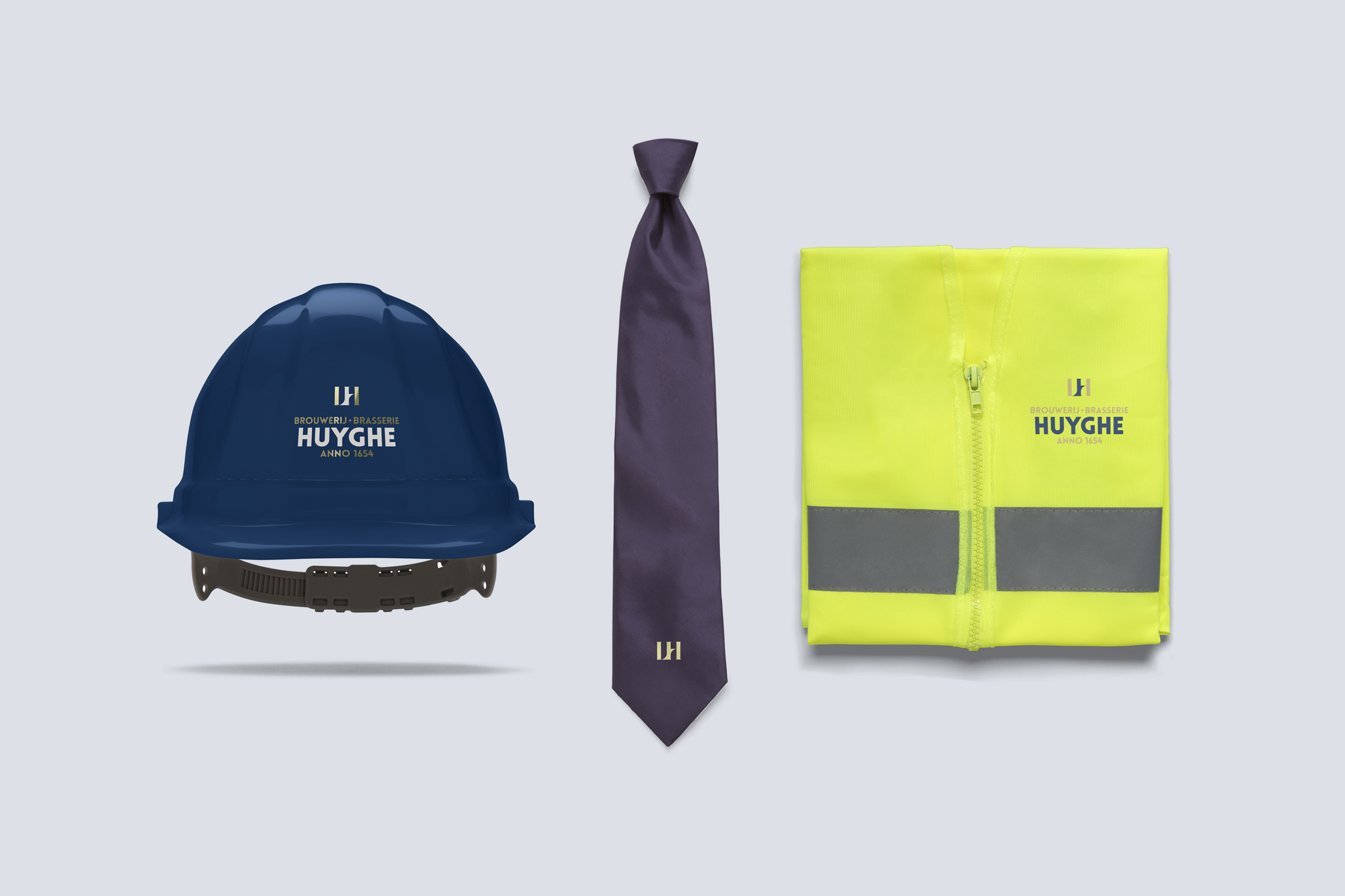
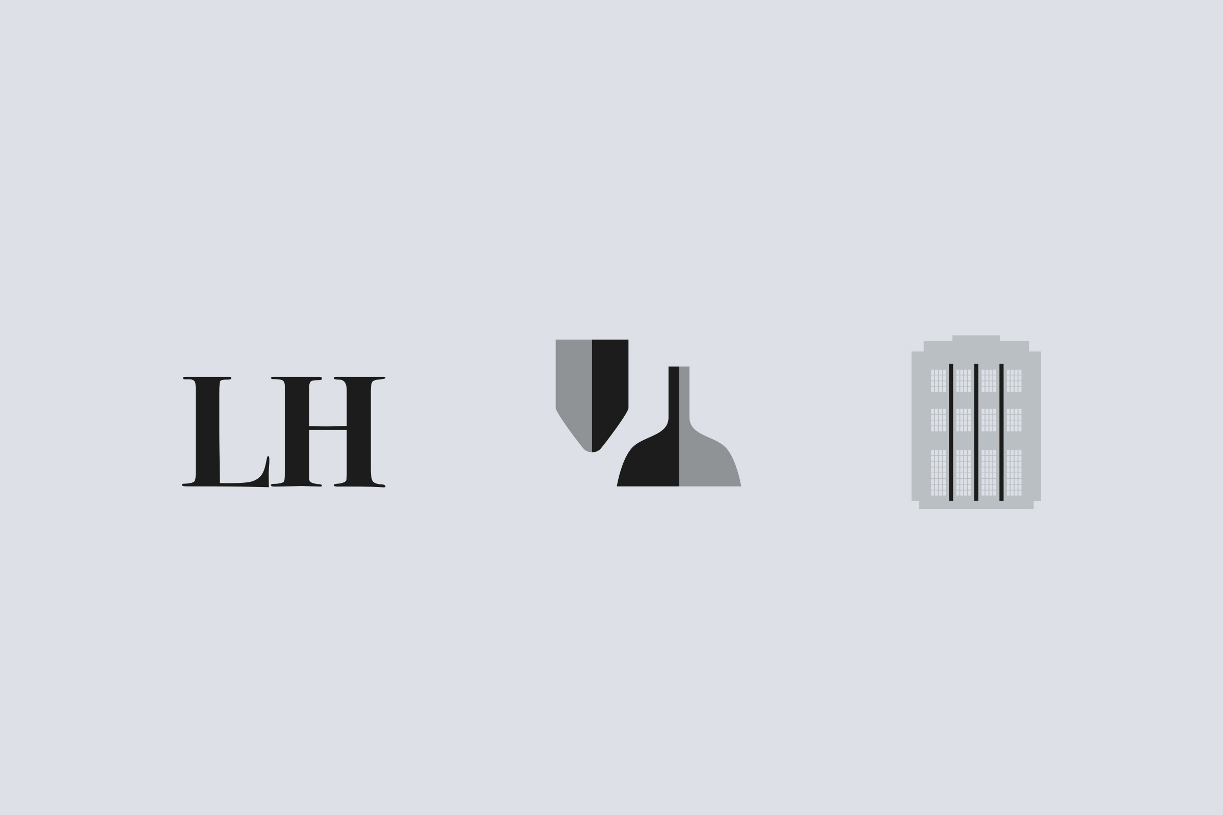
The logo and style had to regain the grandeur of the past. The initials of one of the ‘founders’, Leon Huyghe, were used. As a nice gimmick, a distillation and brewing kettle is included in the negative space of the initials to give the logo multiple layers. The 3 pillars and the addition of the font, in turn, refer to their success period during the Art Deco era.
#strategy #branding #logodesign #graphicdesign
